A lot has been written over the years about Frank Pick and his partnership with Charles Holden. This is my own modest account.
Strong Partnership
Under the leadership of its managing director, Frank Pick, London Transport became one of the world’s leading urban transport systems of the 1930s.
Pick worked closely with others to put together the main elements of what soon became London Transport’s corporate identity.
One of his strongest partnerships was with consulting architect Charles Holden who designed more than 50 Tube stations and helped create a design style that was used on everything from bus shelters to litter bins.
These two men changed the way London looked.
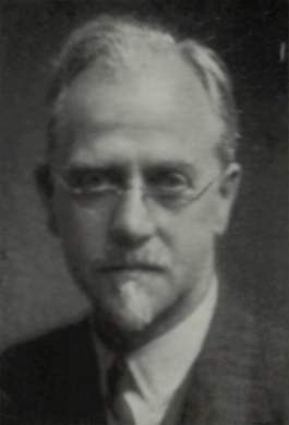
Frank Pick
Frank Pick was born in 1878 in Lincolnshire. He attended St Peter’s school in York and completed a law degree at the University of London. In 1902 he started work at the North Eastern Railway (NER) and within two years he was working as the assistant to the general manager, George Gibb. When Gibb moved from the NER to the Underground Electric Railways of London (UERL) in 1906, Pick followed him.

In 1906 the UERL controlled the District Railway (later District Line) and the majority of the private tube railways (those that would later become the Bakerloo, Piccadilly, and Northern lines). In 1913 it also took over the separate Central London Railway (later Central Line).

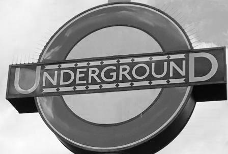
In 1912 Pick became Commercial Manager of the UERL and immediately began to forge a strong corporate identity for the company. In 1913 he introduced Edward Johnston’s typeface that is still in use today. He also began to promote much heavier use of the famous Underground roundel that eventually evolved into a symbol for the whole network. Pick continued to rise through the ranks at the UERL and by 1928 he had become its managing director.

In 1933 the UERL was merged with the Metropolitan Railway (later Metropolitan Line) and amalgamated with London bus and tram operators to form the public concern, the London Passenger Transport Board (LPTB) often better known as “London Transport”. Pick became its first CEO.
Pick worked hard to turn London’s underground, bus, and tram system into a modern and integrated network. Stations and interchanges were rebuilt, and new standardised bus and tube vehicles were ordered and turned out in the London Transport colours.
The UERL’s roundel and typeface were extended to the whole system. Harry Beck’s famous Underground map was introduced, and iconic advertising posters were commissioned to promote travel.

By 1939 London had the most progressive and modern public transport system in the world. Operators from other cities often came to London to see how it was done. Pick himself even got involved with consulting work for the Moscow Metro which was then under-construction.

Pick never lost sight of the need to make transport aesthetically pleasing. He famously said, “London Transport is or will be a work of art”. He was, by all accounts, quite a shy man but he was also a hard task masker. He famously wrote only in green ink. Any subordinates who found instructions written in green knew exactly where they had come from.
Pick’s tenure at the LPTB lasted until 1940. He died prematurely in 1941 at the age of just 62.
Charles Holden
Charles Holden was born, three years before Pick, in 1875 in Bolton, Lancashire. At around the age of 16 he began working for his brother-in-law, an architect and between 1893-96 he studied at the Manchester School of Art and the Manchester Technical School.
Holden worked briefly in Bolton before moving to London in 1899, Shortly after moving to London he joined the practice of Percy Adams (which later became Adams, Holden & Pearson) where he remained for the rest of his life.
His early work included the Belgrave Hospital for Children in Kennington London and Bristol Central Library. These first designs reflected “Arts and Craft” and “Tudor Revival” styles popular at the time.

In 1908 he was commissioned to design what is probably his most significant pre-First World War building: Agar House (now Zimbabwe House), the headquarters of the British Medical Association.
Holden incorporated statues into many of his buildings. For Agar House, he brought in avant-garde sculptor Jacob Epstein whose 18 nude images proved quite controversial in Edwardian Britain.

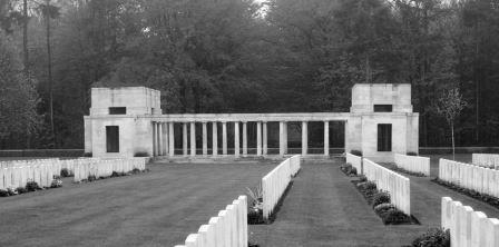
In 1918 Holden was appointed to the Imperial War Graves Commission (now the Commonwealth War Graves Commission) and worked for the next 10 years on almost 70 cemeteries in France and Belgium. His designs for the memorials and graveyards represented a move to a simpler modernist style.
It was this style that first attracted Frank Pick to Holden’s work. Starting in 1922 and lasting for almost 20 years, Holden’s creative partnership with Pick produced what was almost certainly his best work. It earned him the Royal Institute of British Architects’ Royal Gold Medal for architecture in 1936.

Holden’s most prominent building outside of his work with London Underground in the 1930s was the Senate House for the University of London. It was completed in 1937 and received mixed reviews with some critics regarding it as Stalinist or totalitarian. The interior is often better regarded than the exterior. Today it is Grade II listed.

Holden spent much of the Second World War planning new towns and was involved with the City of London’s first reconstruction plans after the war. By the late 1940s he had gradually reduced his workload; the last major building he was involved with was the English Electric Company Headquarters (1956) in Aldwych, London. Like Senate House, this design also received mixed reviews. It has since been demolished.
Holden, who neither drank nor smoked, lived a simple life with his common law wife in a plainly furnished house near Welwyn Garden City. He twice refused a knighthood. He is described [1] by Christian Barman, Pick’s biographer, as “speaking little in a soft voice, as though he distrusted speech and used only the barest necessary”.
He died in 1960.
First Meeting
Pick and Holden first met in 1915. They were both founder members of the Design and Industries Association (DIA), which brought together artists, architects, and businessmen to improve standards of British design. The two men, both northerners living in London, found they had similar views on architecture and shared the “Fit for Purpose” ethos that was at the heart of the DIA’s mission.
That Holden had no experience of designing for transport was not an issue; Pick was already looking for way to move away from the existing style at the UERL and was destined to become Holden’s greatest patron.
Change of Style
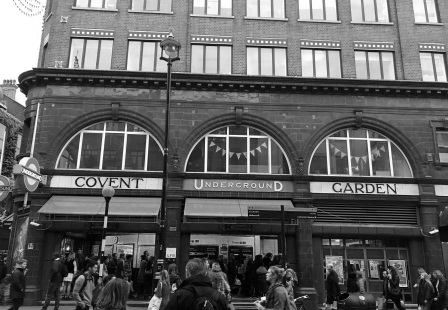
The early UERL tube Stations had been designed by a young architect named Leslie Green working directly for the company. From 1903 Green designed over 50 “tube” stations. Many of them still exist today and their distinctive boxed style and ox-blood-coloured tiling makes them easily recognisable.
Green died from TB at the early age of 33 in 1908 but his assistant Stanley Heaps continued his work in the same style. Kilburn Park (1915) on the Bakerloo Line extension towards Queen’s Park probably represents the pinnacle of this style (It was also one of the first Tube stations to be designed with an escalator rather than an elevator). It soon became clear, however, that the Green-Heaps style was not at all favoured by Pick.

Pick decided that whilst Heaps would remain in his position as the company’s chief architect, (Heaps stayed in the post until the 1940s) an architect from outside would be brought in to assist, advise and guide. Pick consulted with friends and decided to approach Holden.
Christian Barman describes [2] how “Holden recalled years later that Pick had explained to him that he was looking for someone to join him in a search for a new architectural idiom suitable for his new stations.”
First Steps
In 1922/3 Pick gave Holden his first job: designing a façade for a side entrance at Westminster Underground station. The original cluttered entrance was replaced by a much simpler scheme in Portland stone highlighted with the now familiar blue band with the station name in white letters.

Holden then set about helping to redesign the exteriors of six stations on the City and South London Tube (later the Northern line) which were then in the process of being renovated. He worked in collaboration with Heaps and produced similar results as at Westminster working also with cream ceramic blocks in place of Portland stone.
The revamp of stations such as Stockwell, Clapham North and Clapham Common all involved clean finishes with the station name above the entrance, effectively a new lighter style and early evidence of the new image Holden and Pick were starting to develop for the Underground.

Morden Extension
In 1924 Holden was asked to create several UERL buildings for the British Empire Exhibition at Wembley, but his big breakthrough came when Pick commissioned him to design seven new stations for the extension of the City and South London Railway (now Northern line) from Clapham Common to Morden. The designs replaced a set by Stanley Heaps which Pick had found unsatisfactory.

The new Holden designs continued to reflect his simple style and used Portland stone in combination with glazed screens above the entrances. They were clearly “a series of seven” but each one was adapted to suit its own site.
The glazed screens were divided by columns and featured the Underground roundel. These large windows above the entrances provided the ticket halls with plenty of natural light. Floodlighting and bright internal illumination also made the stations particularly attractive at night.
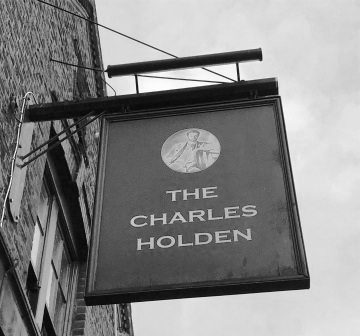
Several are now Grade II listed. The one at Colliers Wood is located opposite the “Charles Holden” Pub which commemorates the architect and his work.
Central London
Holden continued with more station renovations in central London with both Bond Street and St Paul’s stations being redesigned with elements used on the Morden extension: plain stone surfaces, elevated windows, and a glass roundel design.
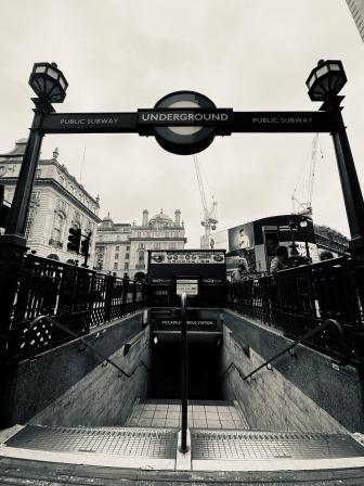
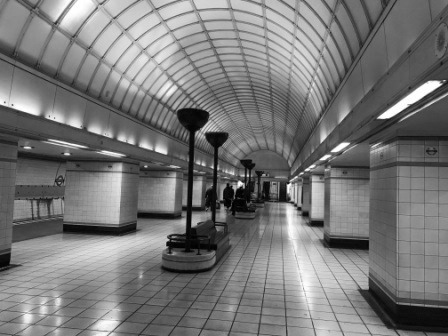
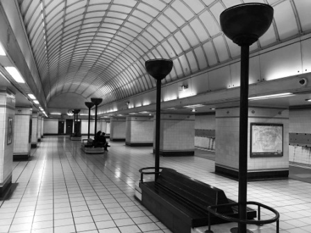
The biggest central London project was Piccadilly Circus, one of the busiest Tube stations of all. It was reconstructed between 1925-28. Holden replaced the surface-level booking halls with a new underground circular hall below the road junction. It was linked to the streets above by multiple stairways and to the platforms below by banks of escalators. It featured shop window showcases, fifty columns and marble wall panelling. Piccadilly became one of Holden’ most celebrated works and is still fully functional today. It is Grade II listed.
55 Broadway
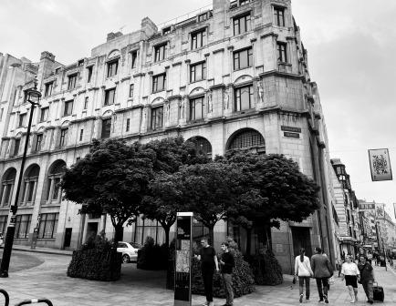
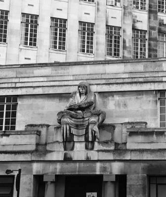
In 1927 Holden designed the “55 Broadway” building which sits atop of St James Park station. This was to be the headquarters of the UERL and subsequently of London Transport. When it opened it was the largest and tallest office block in London. It is a modernist masterpiece and is now Grade I listed.

As at Agar House almost twenty years earlier, Holden brought in Jacob Epstein to design some of the statues for the building. Once again, they proved to be very controversial and, according to some, they almost cost Pick his job!
European Tour
As the collaboration between Pick and Holden began to strengthen, they started to look elsewhere for influences. Modernist buildings were still very rare in Britain, so in 1930 they made a trip around Europe together to look at new public buildings.
They visited Germany, the Netherlands, Denmark, and Sweden to see the latest developments in modern architecture. They were most impressed with the work of Willem Dudok (1884-1974) in the Netherlands and Erik Gunnar Asplund (1885-1940), in Sweden. Holden used these influences for the next series of stations he was about to design for the Piccadilly line extensions, built between 1931 and 1933.
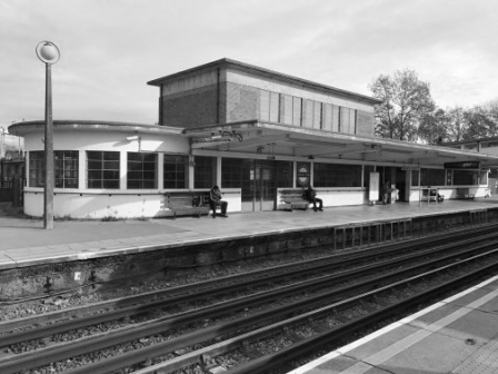
Sudbury Town
Sudbury Town (1931) was the prototype station, and it represented a big step forward in Holden’s Underground design work. It is now a Grade II* listed building.
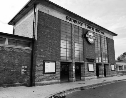
Holden used to refer to it modestly as ‘a brick box with a concrete lid’. In simple terms, it is just that: a rectangular box with large windows for the ticket hall, wings on either side for the offices and waiting rooms and a flat concrete roof that overhangs the box. Yet, it is also very satisfying to look at. It is simple and bold at the same time.
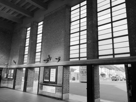
All of Holden’s stations in the 1930s were basically built from “a kit of parts” that followed the Sudbury template. There were different forms: cylinders, towers, curves, and rectangles which were adjusted to suit the station site, but they were all constructed from the same ingredients: brick, concrete, metal window frames and glazed tiling. They all had the same basic look as the first “brick box with the concrete lid”.
Piccadilly line
The new designs for the Piccadilly Line extensions (1931-3) began a new era in London Underground station architecture; it would last the whole decade and introduce many variations of the “Sudbury Park style” to the city.

Like Sudbury Town itself, the new Piccadilly line stations to the west and northwest were conversions of existing District line stations. Working on these existing sites sometimes presented difficulties and forced compromises.

However, the stations on the northern extension from Finsbury Park to Cockfosters were on brand new sites usually with more space and fewer constraints. They represent, what many critics consider to be, Holden’s finest work for the London Underground.
They include….
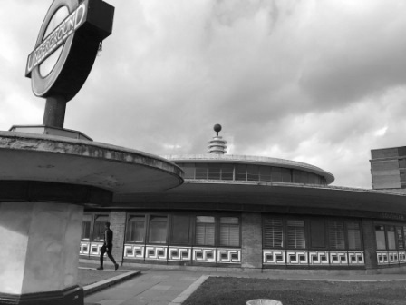
Arnos Grove (1932), influenced by Asplund’s design for Stockholm Public Library and featuring the “Sudbury Town” style in the shape of a circular drum sitting on a box.

Southgate (1933) with its single-storey circular building, flat overhanging roof and elevated central section topped with a Tesla coil sculpture.
Turnpike Lane (1932), apparently Frank Pick’s personal favourite, integrated into a bus station and with a tall ventilation shaft tower acting as the focal point.

Integrated
It was not just the station buildings themselves that Holden was given responsibility for; Pick’s attention to detail called for the fixings, decorations, and furniture all to be integrated into the building’s design to present a common look.
Pick had been horrified by what he saw at Sudbury Town on his first visit. He pointed out several problems: fire extinguishers with no place to accommodate them; automatic machines dumped randomly on platforms; notice boards placed haphazardly on the concourse, and lighting bolted on to a bridge as an afterthought. 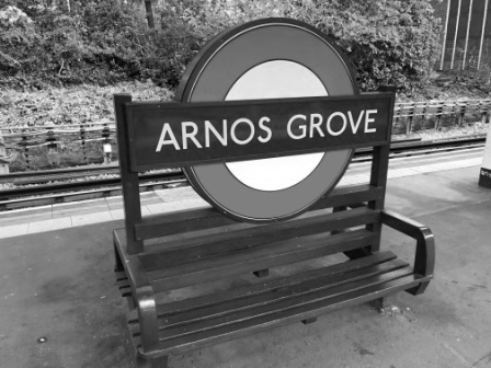
His somewhat harsh conclusion, Christian Barman [3] reports, was “Our effort to provide a model station at Sudbury Town appear to have failed.”
Soon, lighting, including the famous uplighter lamps for the escalators, seating, tiling, clocks, litter bins, and ticket machines were all part of the whole design, often incorporating the Underground’s roundel, and Johnston’s lettering. 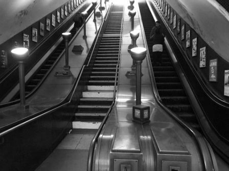
Disappointment
As the 1930s went on, Holden became increasingly distracted by other projects, particularly his work with the University of London. He left some of the designs for the later stations to be handled by Stanley Heaps or by other firms.
Whilst they all followed the “Sudbury Town” house style he had created, they often lacked, in Pick’s view, Holden’s care and attention to detail. Pick was particularly disappointed with Rayners Lane and Eastcote and, perhaps frustrated at being side-lined, requested his consultant architect to take more responsibility for his designs.

Pick, particularly dissatisfied with design work started by other architects, asked that the plans for East Finchley be taken over and improved. Holden added the semi-circular glazed stairways which lead to the staff accommodation on the bridge; they became the Northern line station’s most prominent feature.
Statues
East Finchley also featured a statue of an archer by Eric Aumonier. It was one of several that were planned for stations on the Northern line’s Northern Heights extension plan. There was also to have been a Dick Whittington at Highgate, and a Roman centurion at Elstree South. 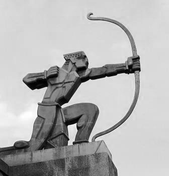
The Northern Heights project was largely postponed by the war and later cancelled. Whilst Holden’s designs for unbuilt stations at Elstree South and Bushey Heath survive, the archer at East Finchley was the only statue realised.
Last Designs
Holden’s last designs for London Transport were for the Central line extension in north-east London. They were completed before the war but not realised until the late 1940s, several years after Pick’s death. Post-war austerity measures meant that the compromises were made on both design and materials.
Probably the most notable is Gants Hill (Central Line) which is in “Moscow Metro Style” with barrel vaulted ceiling. It pays homage to the consulting work that Pick, and Holden were involved in with the Soviet Union.
Lasting Impact
The legacy of the Holden and Pick partnership is very considerable.

Most of the stations are regarded as modernist classics and many are Grade II or Grade II* listed. The former London Transport building at 55 Broadway is regarded as having exceptional interest and is Grade I listed.

There is also no doubt that Holden’s designs for Pick influenced subsequent railway architecture. Even contemporary station designs such as Canada Water and West Ham on the Jubilee line extension have some of the Holden “DNA” in them.

Frank Pick himself has now been commemorated at Piccadilly Circus by a stunning new artwork by Ben Langlands and Nikki Bell. It recalls inspiring words from one of his own lectures. The memorial uses the Johnston typeface that he introduced, and his name is set on the world-famous London Transport Roundel, the symbol of the system he did so much to create.
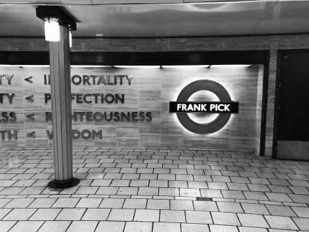
It is perhaps most fitting that the memorial is situated in a Holden-designed station.
Sources / Further Reading
The following books are in my personal collection –
- Barman, Christian (1979) The man who built London Transport. ISBN 0 7153 7753 1
- Green, Oliver (2013) Frank Pick’s London. Art, design and the modern city. ISBN 978 1 85177 757 0
- Menear, Laurence (1983) London’s Underground Stations. A Social and Architectural Study. ISBN 0 85936 124 1
- Tailor, Shelia (2001) The Moving Metropolis. A History of London’s Transport since 1800. ISBN 1 85669326 0
- Wolmar, Christian (2004) The Subterranean Railway. How the London Underground was built and how it changed the city forever. ISBN 1 84354 023 1
- Martin, Andrew (2012) Underground Overground. A passenger’s history of the tube. ISBN 978 1 84668 477 7
Notes
- Barman (1979), p114
- Ibid., p115
- Ibid., p138

.jpg)